
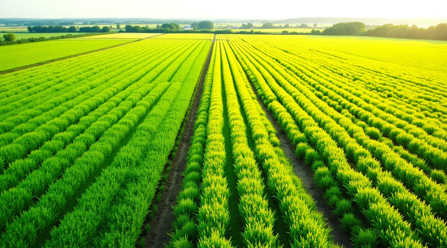
Multispectral Imagery for Early Crop Stress Detection
Learn how multispectral cameras detect crop stress weeks before it's visible to the naked eye, helping you intervene early.
Read Article
Editorial Team
Written by the AgroVision Labs editorial team, focused on practical, transparent guidance for agricultural and forestry imaging professionals.
Forest managers need to see what's changing and how fast. A single satellite image tells you what's there today. But comparing images from month to month? That's when you spot the real patterns. Insect outbreaks, disease spread, drought stress — they all show up in satellite data before they become visible on the ground.
We're going to walk you through downloading free Sentinel-2 imagery and building a simple time-series comparison. You'll see how vegetation indices change across your study area and what those changes actually mean.
Sentinel-2 is your best free option for forest monitoring. The European Space Agency launched it in 2015, and it's been delivering consistent 10-meter resolution imagery ever since. That resolution is good enough to spot canopy changes at the forest stand level without needing to process terabytes of data.
The satellite revisits the same location every 5 days (or 2-3 days if you combine both Sentinel-2A and 2B). That's frequent enough to catch seasonal changes, yet sparse enough that cloud cover won't ruin every image. You're working with multispectral data in 12 bands — visible light, near-infrared, and shortwave infrared. This is what lets you calculate vegetation indices that respond to leaf structure and moisture.

Here's the practical process we use: Start with Sentinel Hub (free account, no credit card needed). Define your study area — a watershed, a managed forest block, whatever you're tracking. Set your date range. Pull 6 to 12 months of imagery at roughly monthly intervals. Download as GeoTIFF files in NDVI format (Normalized Difference Vegetation Index). That's your workhorse metric.
NDVI ranges from -1 to +1. Healthy dense forest canopy sits around 0.7 to 0.9. Stressed or thin vegetation drops to 0.4 to 0.6. Bare ground is near zero or negative. When you stack 12 monthly NDVI images, you can literally see the forest breathing — green-up in spring, peak in midsummer, gradual decline through fall. If a section of forest drops 0.15 NDVI points in a single month? That's a red flag worth investigating on the ground.
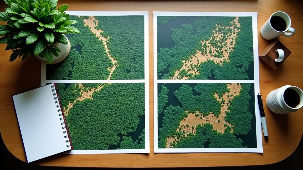
This guide is educational and covers the technical process of obtaining and comparing satellite imagery. Satellite data is one input among many — weather, field conditions, local knowledge, and on-the-ground validation are equally important. NDVI changes can reflect vegetation stress, but they can also reflect seasonal patterns, sensor angle differences, or atmospheric conditions. Always ground-truth your satellite findings before making management decisions. When working with sensitive ecosystems or protected areas, consult with local forestry agencies and follow all applicable regulations.
Once you've downloaded your stack of NDVI images, you'll want to do basic processing. Clip each image to your study area boundary. Stack them into a multi-band file. Calculate month-to-month changes by simple subtraction. If April NDVI minus March NDVI equals -0.08, vegetation declined that month. A jump of +0.12 from May to June? That's active green-up.
Most people use QGIS (free, open-source) or Python with rasterio and numpy libraries. Don't overthink it. You're not building a machine learning classifier. You're just looking for anomalies — areas where the normal seasonal rhythm breaks. Bark beetle infestations show up as sudden NDVI drops in summer. Drought stress persists across multiple months. Disease progression is gradual but consistent. You'll start to recognize patterns after comparing three or four time-series.

Forest managers in British Columbia are using this approach to monitor mountain pine beetle impact across thousands of hectares. Foresters in Quebec track drought stress in hardwood stands. Conservation organizations watch for illegal logging activity in protected areas. The workflow is the same: establish a baseline, compare monthly or quarterly, flag significant changes, send crews to investigate.
The beauty of satellite time-series is scale. You can't walk every hectare. You can't afford helicopter surveys every month. But you can download free imagery and run analysis on your laptop. That shifts forest monitoring from reactive (spotting problems after they're visible) to proactive (catching issues when they're still small and manageable).
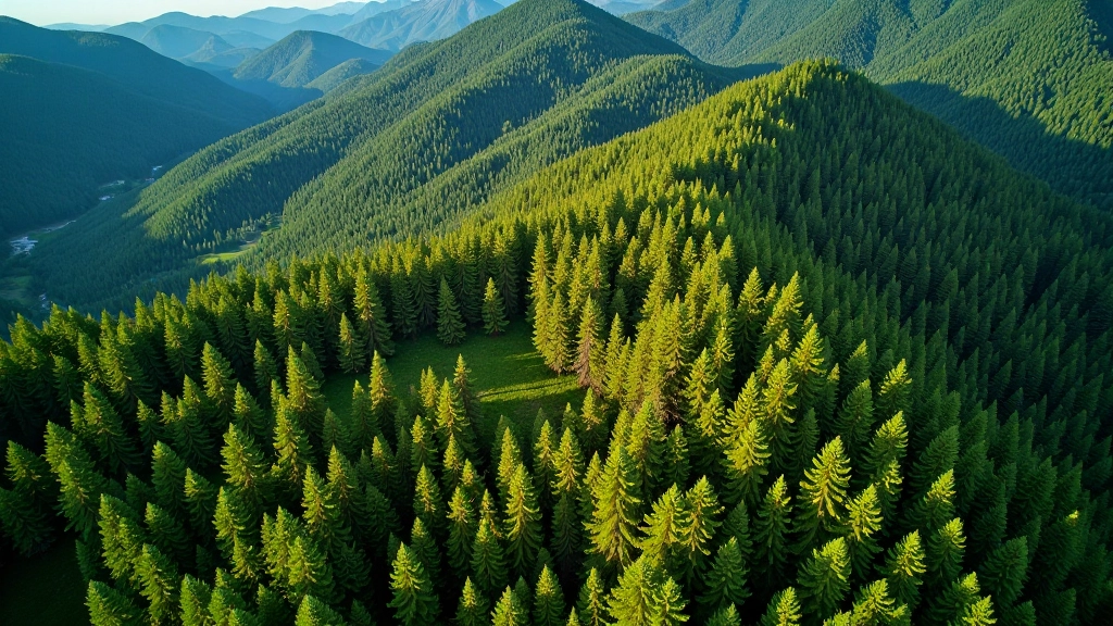
Start small. Pick a forest area you know well — something you can visit to ground-truth what the satellite is telling you. Download 6 months of Sentinel-2 NDVI data. Calculate month-to-month changes. Compare what you see in the imagery to what you know from being on the ground. That's where the learning happens. You'll develop intuition for what normal looks like in your region, and then anomalies become obvious.
The data is free. The tools are open-source. The process isn't complicated. What takes time is building experience interpreting what the numbers actually mean in your specific landscape. But once you've done that, you've got a monitoring system that scales from one forest stand to an entire region.
Learn how multispectral cameras detect crop stress weeks before it's visible to the naked eye, helping you intervene early.
Read Article
RGB cameras versus multispectral versus thermal — what you actually need depends on your specific monitoring goals.
Read Article
Raw satellite imagery isn't useful until you process it. Learn the workflow for turning raw data into decision-ready maps.
Read Article